Overview
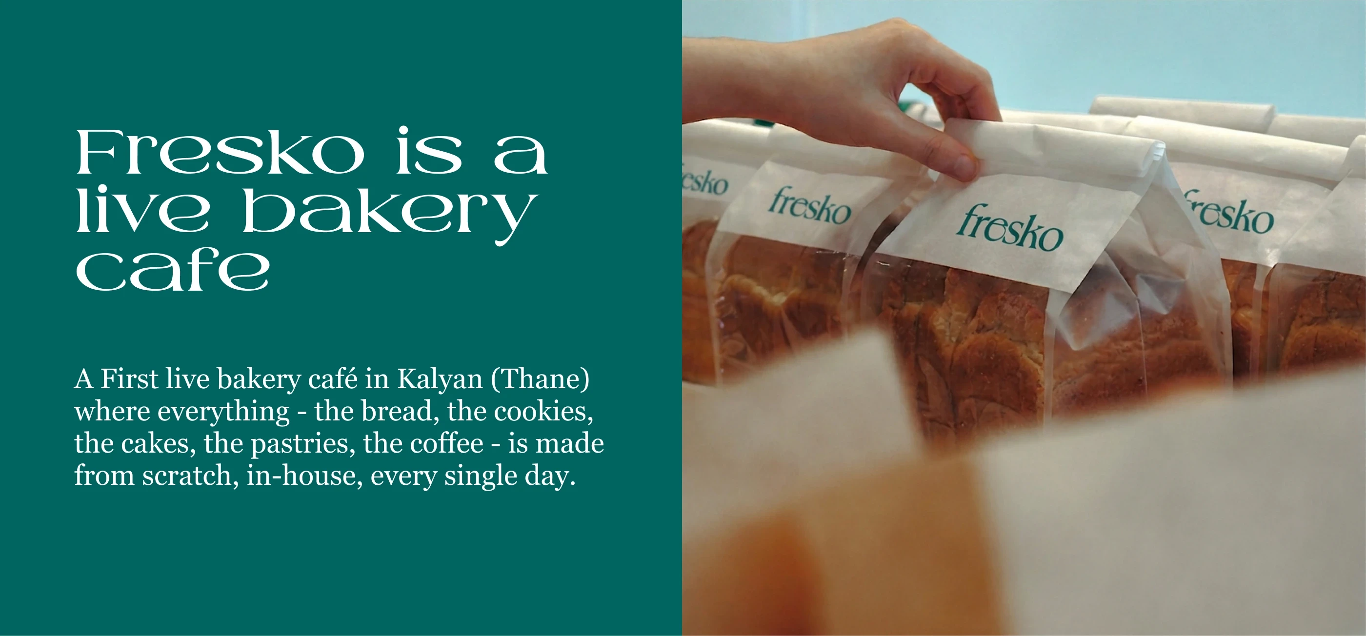
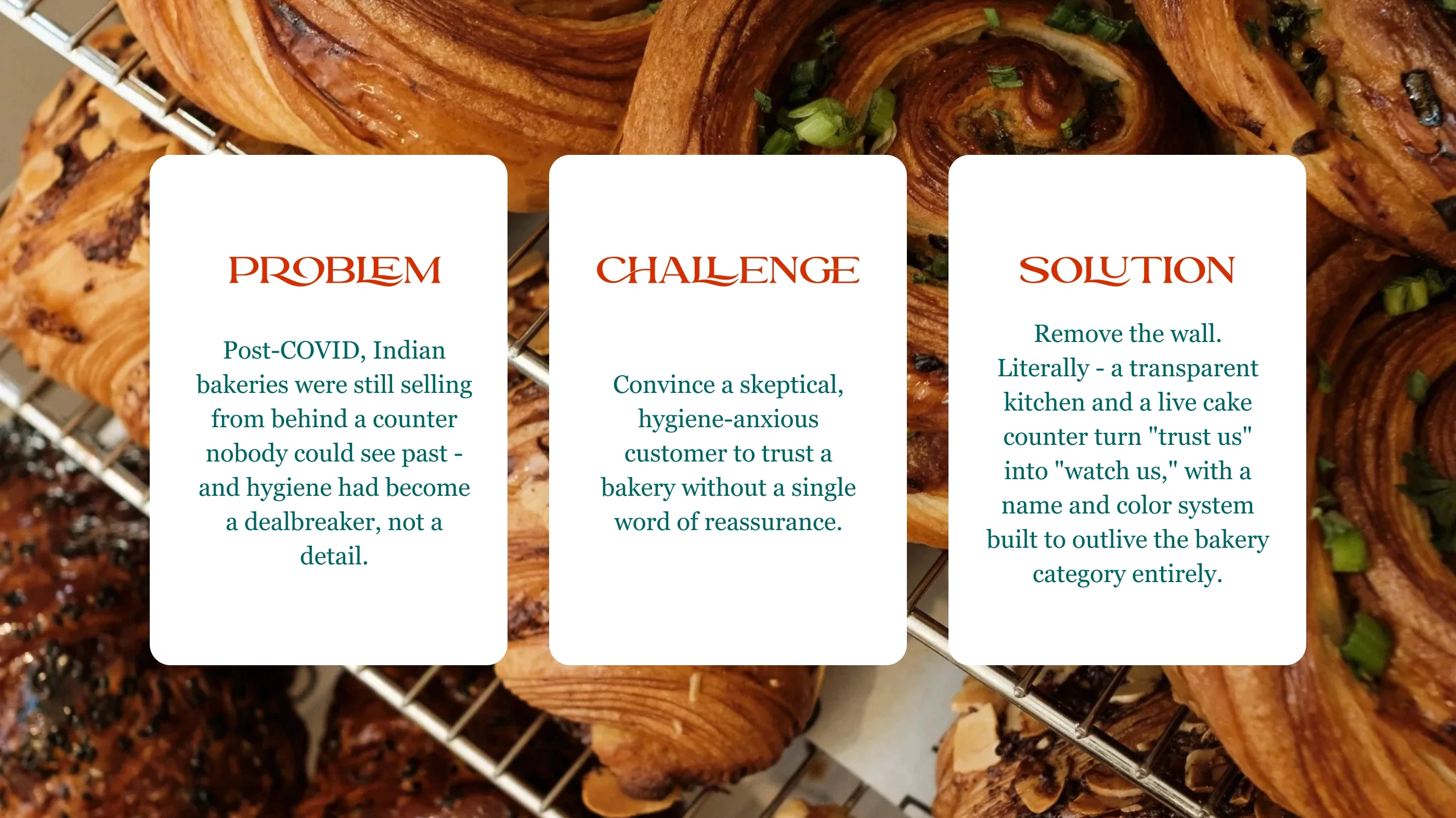
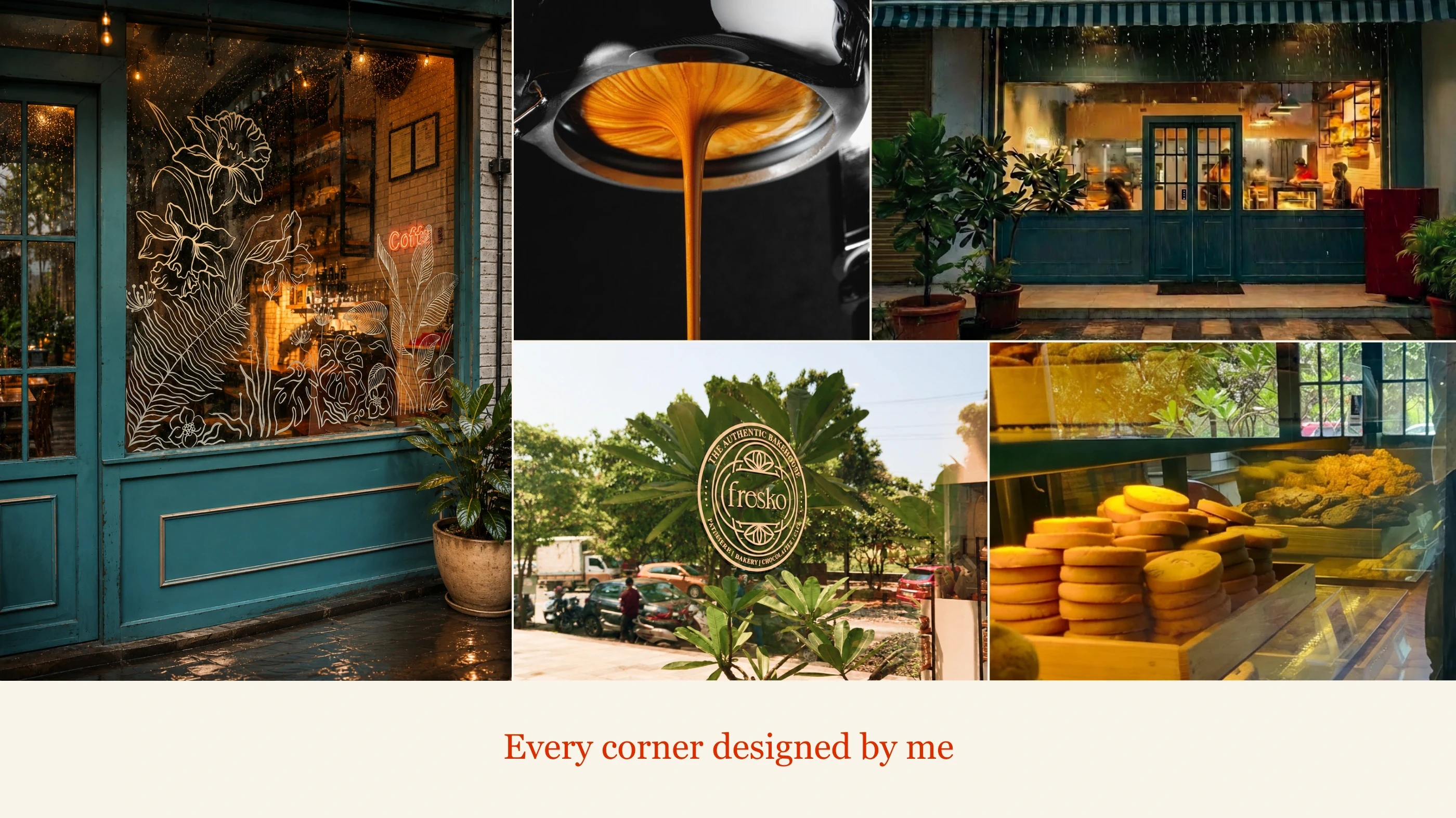
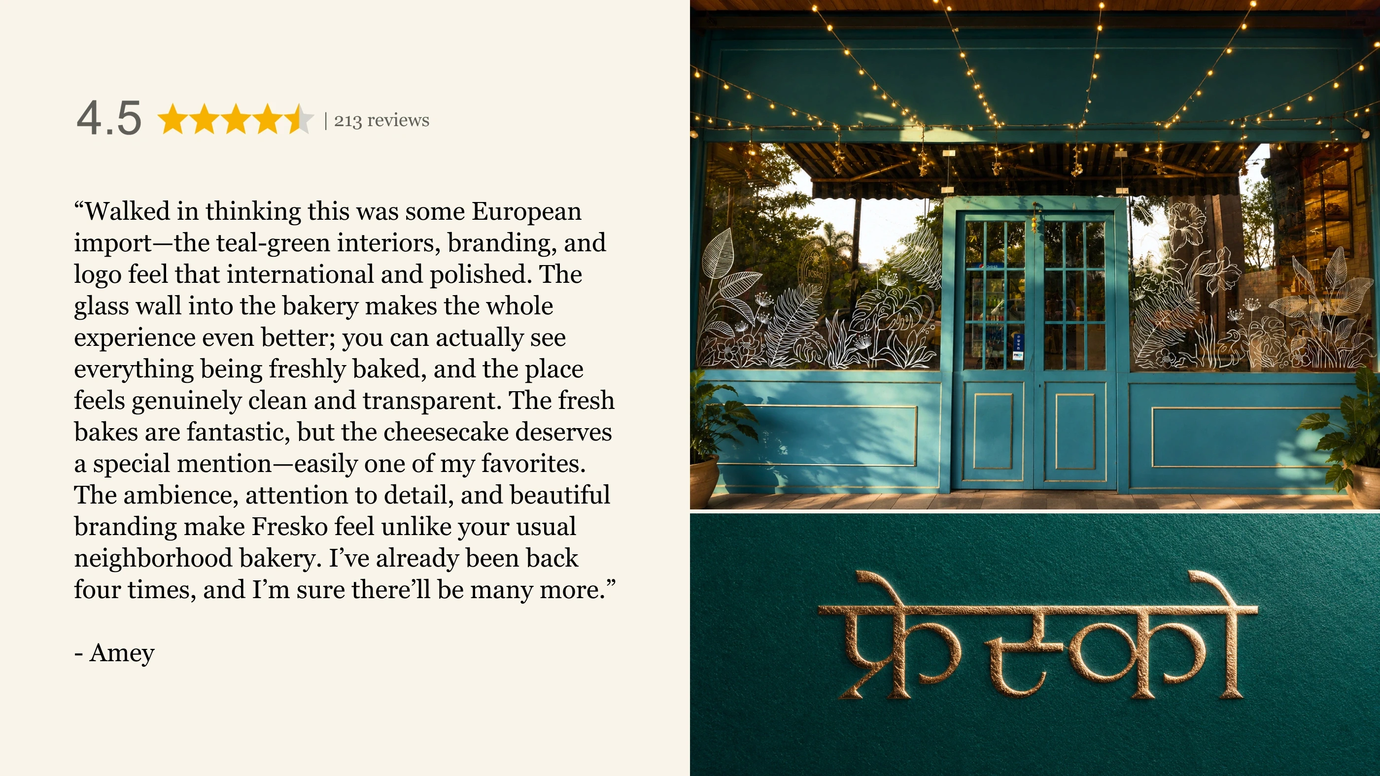
Fresko began with a decision most bakeries would never make: taking down the wall between kitchen and customer. In a category built on nostalgia and neutral tones, that transparency became the entire brand — not a hygiene feature, but proof, on display, order after order. The name (Greek for "fresh") was chosen deliberately generic enough to outgrow bakery altogether, built for a founder already thinking past his first café. Teal — a collision of blue and green — was the visual expression of that same duality: modern enough to break from typical coffee-shop beige, warm enough to still feel local. Fresko isn't a bakery that says it's clean. It's one you can watch being made.
Fresko began with a decision most bakeries would never make: taking down the wall between kitchen and customer. In a category built on nostalgia and neutral tones, that transparency became the entire brand — not a hygiene feature, but proof, on display, order after order. The name (Greek for "fresh") was chosen deliberately generic enough to outgrow bakery altogether, built for a founder already thinking past his first café. Teal — a collision of blue and green — was the visual expression of that same duality: modern enough to break from typical coffee-shop beige, warm enough to still feel local. Fresko isn't a bakery that says it's clean. It's one you can watch being made.
CLIENT
Fresko
YEAR
2021
DELIVERABLES
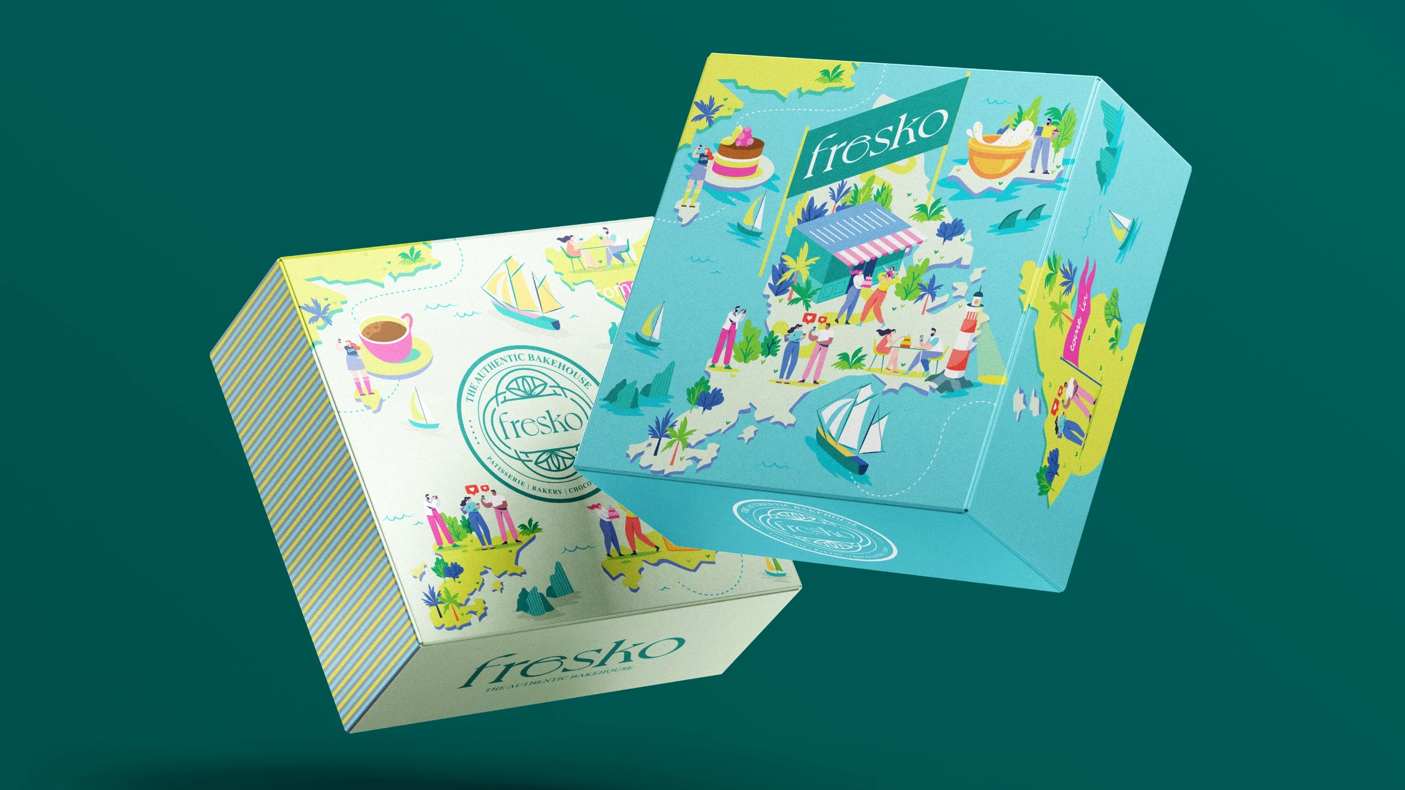
Branding Photography Packaging Space Design Cohesive Language
Other projects